Group: Wellbeing Profile Filtered
Click to view full screen…
This report breaks down the group data by demographic categories, making it easy to spot patterns or differences across subgroups within your cohort.
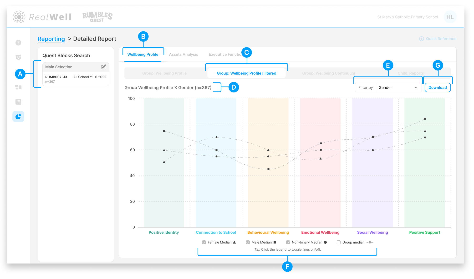
(A) Quest Blocks Search — The Quest Block(s) and sample size for this report. Your selection represents the data collection period you're reporting on.
(B) Wellbeing Profile — The active reporting group
(C) Group: Wellbeing Profile Filtered report tab — The active report
(D) Sample size — The number of children included, e.g. "Child Reports (n=367)"
(E) Filter by — Select a demographic category to break down the data. Options include:
Gender
Grade
First Nations Status
(F) Legend — Shows each filtered category with a toggleable checkbox and distinct marker (e.g. square, triangle, circle). Hover over a legend key to highlight its corresponding line on the chart. Click to toggle lines on and off.
(G) Download — Download the chart and associated scores as a PDF
Reading the Filtered Chart
Each domain column shows multiple data points, one per filtered category, connected by lines so you can compare trends across the profile.
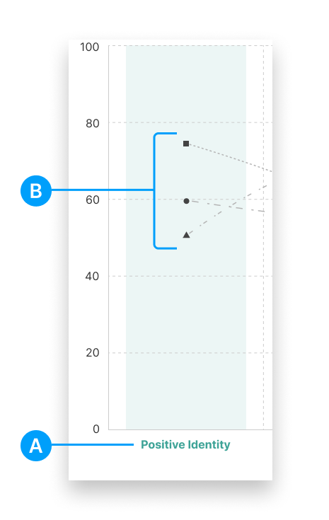
(A) Domain label — The wellbeing domain name
(B) Category data points — Each marker shape represents a different category (e.g. Female, Male, Non-binary when filtering by Gender)
The domain columns are colour-coded to match their respective wellbeing domains, making it easy to scan across the chart.
Tip: If the chart looks crowded with multiple categories, use the legend checkboxes to toggle lines on and off. You can also turn the overall Group median line off to focus on the filtered categories.