
Group: Wellbeing Profile
Click to view full screen…
The default view when you open the Wellbeing Profile tab. It shows your group's median score for each of the six wellbeing domains, giving you a snapshot of overall group wellbeing at a glance.
The median is the middle score in your group, half of the children scored above it and half below. It gives a reliable picture of your group's typical result without being skewed by unusually high or low scores.
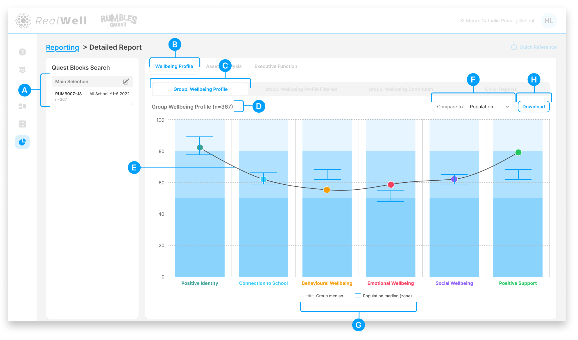
(A) Quest Blocks Search — The Quest Block(s) and sample size for this report. Your selection represents the data collection period you're reporting on.
(B) Wellbeing Profile tab — The active reporting group
(C) Group: Wellbeing Profile report tab — The active report
(D) Sample size — The number of children included, e.g. "Child Reports (n=367)"
(E) Group Wellbeing Profile — The chart displaying your group's wellbeing data, with median scores plotted across all six domains
(F) Compare to — Overlay benchmark data onto the chart. Options include Population (all organisations) and Like Schools (school organisations only).
(G) Legend — Shows what the chart elements represent (Group median, Population median/zone). Hover over a legend key to highlight its corresponding line on the chart.
(H) Download — Download the chart and associated scores as a PDF
Reading the Chart
Each domain is represented by a column with a coloured dot marking your group's median score. The column's blue shading indicates the wellbeing ranges (Struggling, Coping, and Strong), so you can see at a glance where your group's median sits relative to those bands.
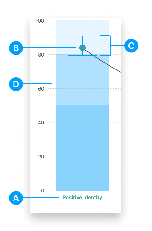
(A) Domain label — The wellbeing domain name, colour-coded for easy reference
(B) Group median — The coloured dot shows where the middle score of your group sits on the 0–100 scale
(C) Population benchmark — When Compare to is active, a box-whisker plot shows the population median and range for comparison
(D) Wellbeing range bands — The shaded bands represent the Struggling, Coping, and Strong ranges for each domain
Comparing Your Data
Use the Compare to dropdown to overlay benchmark data onto the chart. The available options depend on your organisation type:
Population — Compare your group's results against the broader Rumble's Quest population norms
Like Schools — Compare against schools with a similar profile (available to school organisations only)
When a comparison is active, a box-whisker plot appears on each domain. The line marks the population median, and the whiskers show the confidence range around that estimate.